
Getting into Amazon – the world’s biggest online marketplace – is a great start. Standing out as a seller is a whole new ball game.
To give your brand more visibility in Amazon’s somewhat overcrowded space, you need to create a store.
Looking for inspiration for your new store?
No problem.
We’ve handpicked some of the best Amazon storefronts to give you a head start. So, let’s get the ball rolling with a quick overview of what an Amazon storefront is.
What is an Amazon Storefront?
An Amazon storefront is a mini Amazon website personalized for your brand or business.
Think of your Amazon storefront as a dedicated homepage for your products and related content on Amazon.
It allows visitors to your mini-website to browse through your products without the distraction of search results popping up all over the main Amazon homepage.
In other words, you have a huge advantage with a dedicated area for your products, as it allows prospective buyers to focus solely on what you sell without getting bombarded with offers from the other 2.4 million active sellers on Amazon.
But that’s not all. Having an Amazon storefront gives you other benefits as follows:
- Leverages Amazon’s global reach to help you build a professional image for your brand. In addition to increasing brand recognition, this helps foster buyers’ trust and encourages loyalty.
- Your personalized Amazon URL that looks something like this: amazon.com/your-store. This allows you to boost your organic ranking on searches engines when you use it as a landing page for ads on external sites.
Best Amazon Storefront Examples
Now that we have all of that out of the way, here is a selection of the very best Amazon storefronts to get you inspired.
These examples use different content and layouts to design outstanding, attention-grabbing, and professional-looking stores.
You can learn a thing or two from these storefronts to help you create a high-converting store while protecting your customers’ interests.
1. Amazon Basics
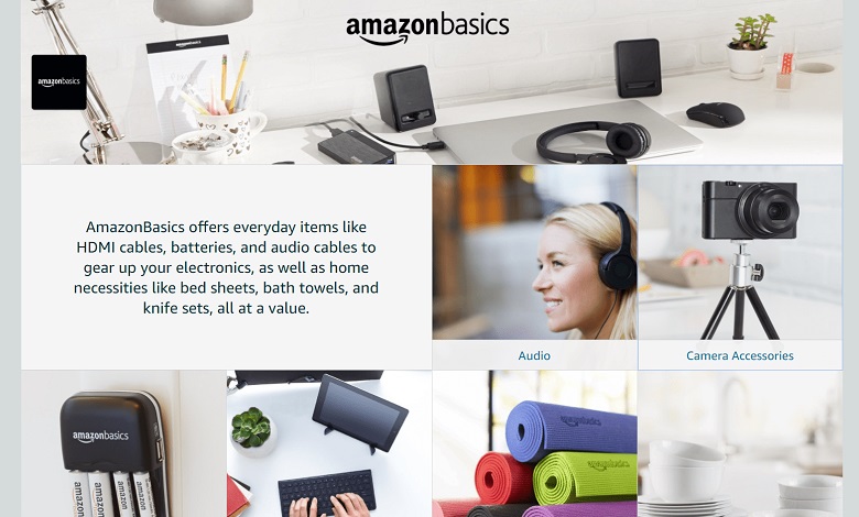
What better place to start than Amazon itself! After all, the creators of the Storefront feature should have a few tips and tricks worth looking at.
The AmazonBasics storefront is an excellent example of a simple yet effective store.
Amazon’s utilization of simplicity makes the product selection very compelling without feeling overwhelming. This helps shoppers quickly navigate the store and increases the chances of conversion.
Standout Features
Here is why AmazonBasics is a good example of a storefront:
- Smaller grid design: Amazon is a one-stop-shop for just about everything you can buy online. Using a smaller grid design is perfect for displaying a wider array of products at the same time.
- Clear header menu: Navigating the store is a breeze, thanks to the clear header menus. This makes it easy for shoppers to find what they are looking for.
- Straightforward category titles: Category titles, such as “Fitness,” “Kitchen,” and “Pet supplies” are pretty straightforward. Just about anyone can quickly understand what they are and where to find what they want to buy.
- Simple imagery: AmazonBasics uses clean and simple images to hold customers’ attention without overwhelming them.
Takeaways
If you plan on creating a storefront to showcase a wide variety of products, consider going with AmazonBasic’s smaller grid design.
Remember to keep things simple with straightforward category titles and header menus. This will make it easy for shoppers to quickly navigate your production selection.
2. Callaway

Callaway is an Amazon golf retailer with an incredibly intuitive store, making it one of the best Amazon storefronts.
Professional golfers and enthusiasts can easily find golf products in the store, thanks to its brilliantly organized navigation bar.
Although Callaway has plenty of golf products, its homepage isn’t overcrowded with tons of product images. A few images of the brand’s best products are boldly visible when you land on the homepage.
Standout Features
Check out the features that make Callaway a good example of an Amazon storefront.
- Brand logo: Visitors are greeted with the brand’s logo front and center. This builds brand recognition, which is linked to loyalty or more repeat buys.
- Large grid design: While this template allows room for only a few products, they have the effect of jumping out at shoppers and grabbing attention for longer periods than if too many products are on display.
- High-quality product images: High-definition images with the quick look option gives shoppers better zoom levels to see more product details.
- Pricing: Visitors can see price tags on each item right on the front page. This makes it quicker for shoppers to make buying decisions.
Takeaways
A large grid design will most likely suit your brand if you want to showcase only a handful of product images on your mini Amazon website homepage.
But to make this more effective, consider using images with high dpi so they won’t lose too much of their quality when potential customers zoom in to see more details.
Consider placing your brand logo in a conspicuous area on your homepage. This strategy will help increase brand recognition and is particularly very useful if you are a small business looking to make a name for yourself in your industry or niche.
3. Petcube
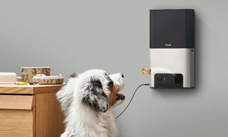
Petcube is a superb example of a brand with excellent knowledge of its target market.
In addition to featuring cute dogs and cats as its product models, the brand illustrates an ideal balance between product placement and key features.
At a glance, shoppers can see how the product works, the different prices, and even buy products immediately using the Shop Now button.
Petcube’s Amazon storefront is a stellar example when it comes to blending product info with images in the most captivating and effective way.
Standout Features
Petcube is an excellent Amazon storefront example with the following features:
- Price range: In addition to displaying price tags on each item on the home page, visitors get to see similar products in different price ranges. This is a smart move to keep customers in the store instead of looking for less expensive alternatives elsewhere.
- Product demo: Instead of showing only the product image, Petcube includes typical use-case images to help buyers understand how the product works.
- Comparison with other brands: The navigation, as well as the product categories, shows Petcube’s advantages over similarly-priced products from other brands.
- Call-to-action button: The “Shop Now” button is featured on each product on the home page. This encourages shoppers to make buying decisions very quickly. Once clicked on, the button skips the category section and takes buyers directly to where they can buy the product immediately.
Takeaways
If your inventory includes similar products of varying prices, it would be a great idea to feature a few of the best options on your store’s homepage. This way, visitors won’t have to shop around beyond your store.
Your store isn’t created merely for browsing products and seeing cute images. The main goal is to convert visitors into buyers – loyal buyers for that matter!
For this reason, it is a good idea to add a call-to-action button on your homepage to help shoppers make buying decisions very quickly. They shouldn’t have to navigate categories and subcategories before seeing a “Buy Now” or “Shop Now” button.
4. Apple
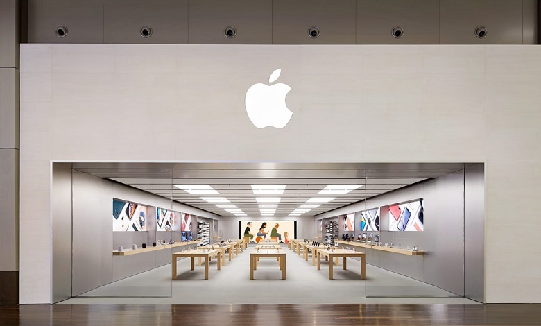
Apple is a well-known brand across the globe. Yet its logo is smack at the top center of the Amazon store homepage.
You may think a brand with Apple’s reputation wouldn’t bother so much about brand recognition, but that’s clearly not the case.
There’s something polished about Apple’s Amazon store. It is clean and simple, yet the storefront gives off a professional feel.
In addition to its attractive aesthetics, the brand’s Amazon store has a similar look and feel as its official website.
Although Apple has tons of products selection, you won’t find them on the homepage. Instead, the brand displays exceptional organizational skills by grouping products into easy-to-identify categories and subcategories.
Standout Features
Here’s why Apple’s storefront is a stellar example where you can draw inspiration:
- White spaces: While Apple’s products are displayed in bright colors, the store uses white spaces to highlight the products.
- Large text format: Apple uses big, black, and bold text on each product category to complement the overall clean appearance of the store.
- Simple category titles: With titles like “iPad,” “iPhone,” “Watch,” and “AirPods,” it is extremely easy for shoppers to browse and find what they are looking for.
Takeaways
Embrace white spaces! Filling every inch of space with graphics or text can make your homepage look clumsy.
You want visitors to get a “spotless” feel when they visit your store, even if you don’t sell electronics or gadgets like Apple.
5. Beats

Beats Amazon store is a clear example of how to maximize the homepage of your mini Amazon website.
The company sells speakers, earphones, headphones, and related products. Shoppers are not left guessing when they visit the storefront.
Instead, they are immediately greeted with the brand’s best products when they land on the homepage.
Standout Features
Here’s why Beats is one of the best Amazon storefronts:
- Shared images: Each product image on the homepage features two images. One shows the product and the other shows the use case. For example, Powerbeats shows an image of the product on one hand and a runner wearing it on their ears while running outdoors.
- Best features on images: Information about the critical features of the products is shown right on the images. This makes it easier for shoppers to understand what each product can do without necessarily clicking on the image to get more details.
- Uniform theme: The images and text blend nicely in a somewhat dark theme layout. This gives the homepage a uniform feel without being noisy.
Takeaways
Using shared images in your storefront can give potential customers a better understanding of how your products are used in real-life situations.
Also, consider including special features of each product on the display image. This will save time for shoppers since they can quickly see each product’s capabilities right from your storefront’s homepage.
6. Indo Board

Indo Board offers expertly designed balance boards to fitness enthusiasts and athletes of all experience levels.
It’s Amazon storefront sells only one product – the balance board. And if you assume that’s not enough to create an entire mini website for, think again!
It takes a savvy brand to use a single product to create several categories in its store. Indo Board did this so expertly that the store keep visitors highly engaged, thanks to the mix of lifestyle images and video demonstrations.
The homepage doesn’t just display categories, though. Clicking on the “See products” call-to-action button on products pops up a window with the product details, including name, price, rating, number of buyers, and the “add to cart” button.
Standout Features
You can get inspiration from some of these store features:
- Video clips: In addition to product images, Indo Board uses video demonstrations to show viewers how to use its products.
- Excellent navigation: The menus are self-explanatory and easy to navigate, allowing customers to quickly find what they are looking for.
- Clever call-to-action button: Unlike other stores with the “Buy Now,” or “Shop Now” button, Indo Board cleverly uses the “See products” button in combination with the “Add to cart” button for quick and convenient purchases.
Takeaways
Indo Board is proof that you don’t need a wide range of different products to give your store visitors an exciting shopping experience on Amazon.
All you need is to come up with creative ways to group the different designs and styles of your product into different categories.
Consider going beyond still images to short video clips, especially if you sell a one-of-a-kind product. This will give shoppers a better understanding of what the product is and how to use it.
7. Netgear

With a focus on technology-related products, Netgear’s Amazon store has a sleek modern look that’s highly informative as well.
You don’t have to navigate or dig deeper to get product info because they are displayed right on the homepage.
While there are several product categories, shoppers can view product details directly on the landing page. This includes the product name, image, brief description, and price tag.
Standout Features
Here are some of the features that make Netgear’s store a good Amazon storefront example:
- Quick view button: In addition to displaying product details on the homepage, the brand uses the quick look button to give shoppers additional product information and includes the “add to cart” button for quick and convenient purchases.
- Sleek theme: The store has an overall play of black and white colors to blend with the product colors.
Takeaways
Consider making it easy for shoppers to buy your product when they visit your store. Display key product features and price where and when it makes sense.
8. Lego
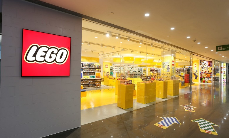
Last on our list (but definitely not the least by a long shot) is Lego’s storefront.
If there is one store on Amazon that resonates so well with its target market, it is Lego. Visitors know right off the bat that they are in the right store as soon as they reach the homepage.
From the bright graphics to the brilliant combination of colorful displays and the brand’s logo; everything spells Lego!
The storefront separates products into different categories, including themes, age, new releases, and best sellers.
Standout Features
Lego is undoubtedly one of the best Amazon storefronts with several distinguishing qualities, including:
- Audience targeting: By grouping products into different age categories, Lego targets buyers in different age brackets more effectively. The brand even uses different color schemes to appeal to different age groups.
- Personalized shopping experience: Visitors can shop by interest in addition to getting recommendations based on their browsing behavior. This personalized touch makes it a lot easier and faster for customers to see products they’ll likely be interested in buying.
- Call-to-action buttons: Every product image on the homepage features a “Buy Now” or “Shop Now” button. This is an excellent way to get visitors to buy products quickly.
Takeaways
Understanding your target market is very crucial when creating a storefront.
You don’t necessarily need to play around with colors like Lego (unless you have a similar audience with Lego).
But one of the features that can keep visitors browsing your store for longer periods is making them feel at home with your overall store theme.
Consider offering product recommendations based on visitors’ browsing behavior. This puts what they are likely to buy right in front of them and increases the chances of converting shoppers.
Further reading: How to find your Amazon storefront link.
Conclusion
You will notice that the best Amazon storefronts streamline their stores to suit what they sell rather than include too many features.
The most effective way to get the best out of your Amazon store is to align its features with what works best for your brand. This way, you will attract more of your target audience to browse your products and increase your chances of conversion.
Keep the takeaways for each Amazon storefront example in mind when you create your store. These tips will help you design intuitive and high-converting stores.